
Collections
Collections are for content that repeats with the same shape — many items, all with the same fields. Posts and pages are free-form writing; a collection is closer to a spreadsheet, one row per item.
What they look like
- Team members — name, role, photo, bio.
- Events — title, date, location, ticket link.
- Products or menu items — name, price, vegetarian yes/no, photo.
- Also common: testimonials, FAQ entries, job openings, portfolio projects, store locations.
What they're good for
- Editing without touching layout — add or change an entry and the design stays put.
- Consistency — the tenth item looks like the first, and a required field can't be skipped.
- One source, many places — the same entries can be embedded wherever you need them.
- Sorting and filtering — query by typed fields, like "upcoming events" or "vegetarian under $15."
- Precise updates — the assistant can add, edit, or publish entries exactly, field by field.
Tovu's own feature list is a collection
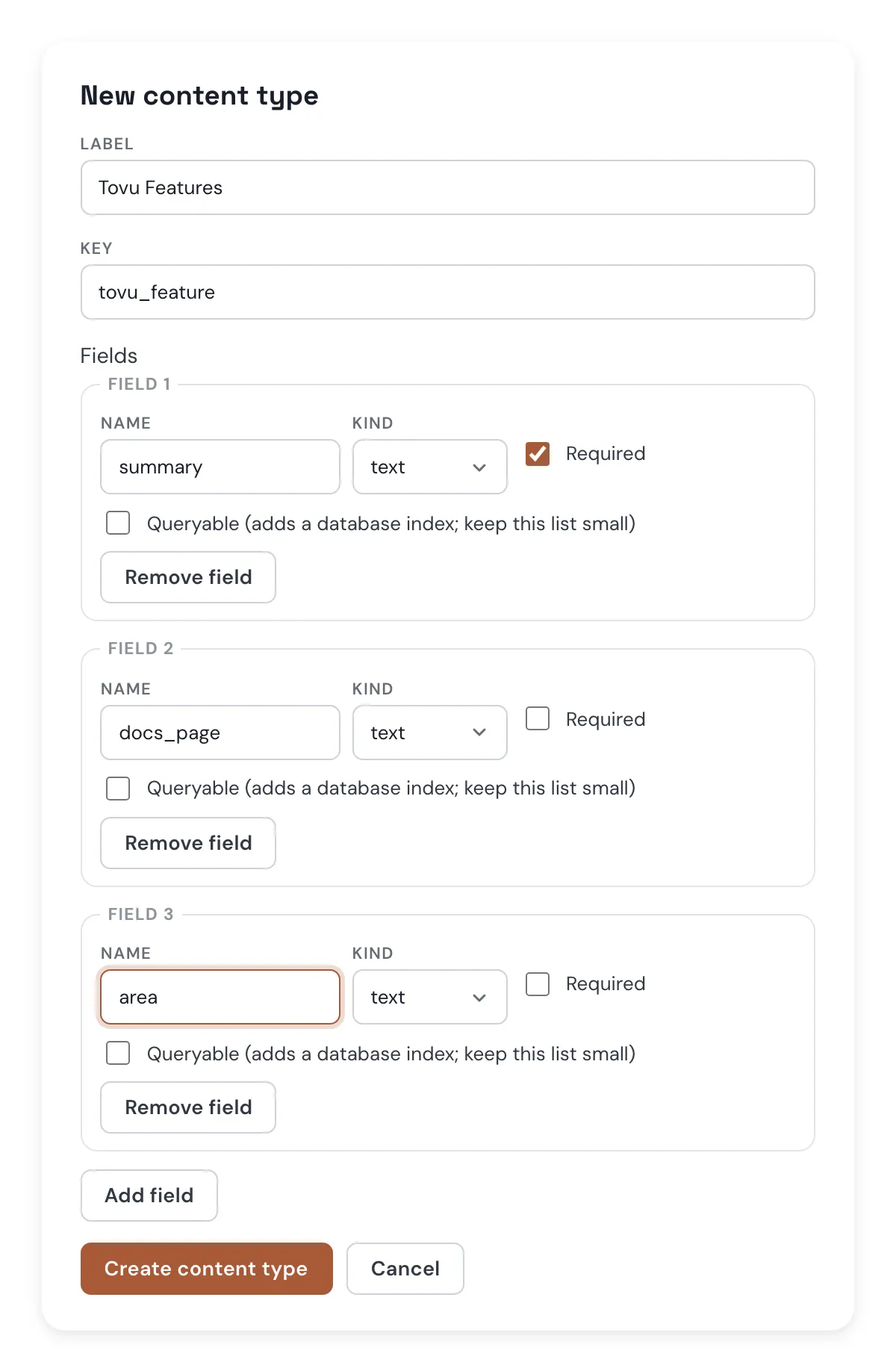
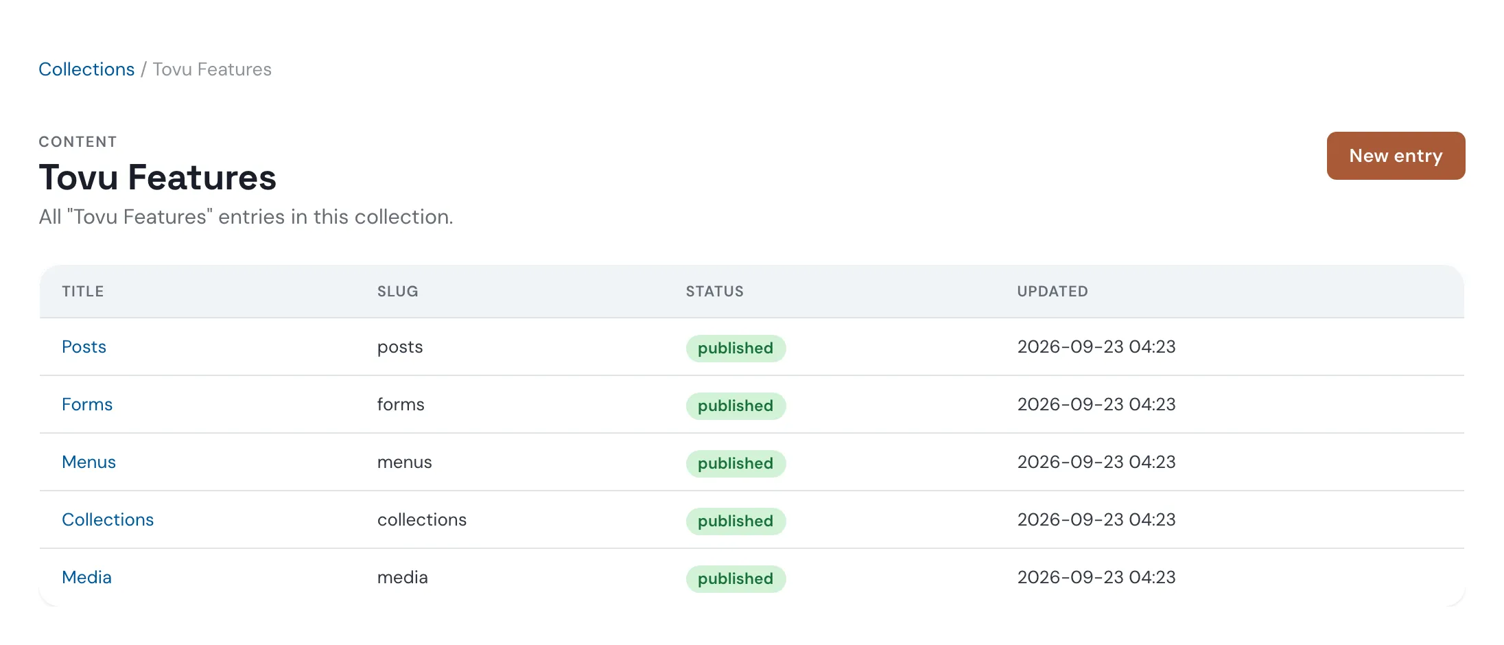
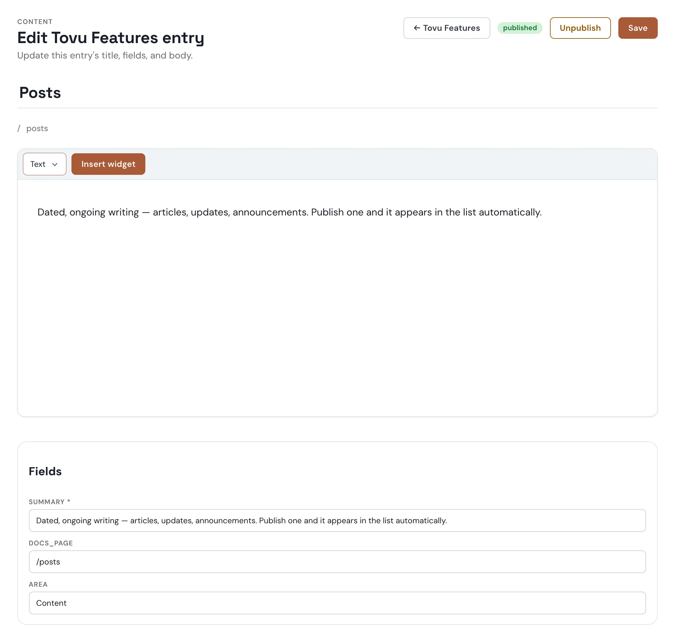
Tovu keeps its own feature list in a tovu_feature collection: one entry per shipped feature, each with a summary, a docs link, and an area.
Creating a collection
- Under Content → Collections, click New content type.
- Give it a label and a key, then add fields — each with a name, a kind, and whether it's required.
- Add field for more rows, then Create content type.
Adding entries
- Open the type's Manage entries, then New entry.
- Set a title and slug, write the body, and fill in each field.
- Save first — Publish appears once the entry is saved.
Showing entries on a page
Add a collection's published entries to any HTML page with a collection embed. On the Collections screen, each row has a Copy embed code button that copies the minimal marker for you:
<div data-embed-config='{"type":"collection","id":"tovu_feature"}'></div>Options
| Key | Default | What it does |
|---|---|---|
id | — (required) | the collection's key |
where | none | one or more {"field":"value"} pairs, exact match only |
sort | newest | newest, oldest, updated, title, a field name, or -field for descending |
limit | 6 | up to 24 |
layout | cards | cards or list |
columns | 3 | up to 6; cards only |
fields | every field | which of the type's own fields to show |
An unknown field name in where, sort, or fields, or an id that isn't a real collection, is rejected outright — the embed shows its own fallback content instead of an unfiltered list.
Laying it out yourself
Put a <template> inside the marker to write each entry's markup yourself, with {{title}}, {{date}}, {{url}}, and {{fields.<name>}} placeholders. Everything is HTML-escaped, and a placeholder used inside href or src is checked before it's used. {{url}} is empty for now — entries don't have their own page yet, so link a field instead, like docs_page below. Style the whole list with class or style on the marker's own tag; it stays as the list's wrapper.
This page's own feature list, live, each entry linking to its docs page:
<div data-embed-config='{"type":"collection","id":"tovu_feature"}'>
  <template><div class="feature-card"><h3><a href="{{fields.docs_page}}">{{title}}</a></h3><p>{{fields.summary}}</p></div></template>
</div>{{title}}
{{fields.summary}}
See Embeds for the full marker reference, including the default card and list look with no <template> at all.